|
|
Post by Rain on Mar 23, 2008 11:00:54 GMT -5
lol Ill probably find something on deviant art  Its the Wikipedia of the graphics world  |
|
MyNameDidntFit
Athenak  Top BotC Competitor! TEQUILA![M:25]
Drinks Bourbon
Posts: 596
|
Post by MyNameDidntFit on Mar 23, 2008 11:01:26 GMT -5
Except more trustworthy  |
|
MyNameDidntFit
Athenak  Top BotC Competitor! TEQUILA![M:25]
Drinks Bourbon
Posts: 596
|
Post by MyNameDidntFit on Mar 25, 2008 3:01:26 GMT -5
Well, here's my latest piece:  Feedback please  |
|
MyNameDidntFit
Athenak  Top BotC Competitor! TEQUILA![M:25]
Drinks Bourbon
Posts: 596
|
Post by MyNameDidntFit on Mar 29, 2008 11:43:47 GMT -5
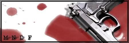
 No-one seems to be interested in my last one... Oh well, here's version 2 of it; completely different, just both have blood and a Beretta. Anyway, this is what the first one was initially meant to look like but I got sidetracked with brushes...  |
|
|
|
Post by Rain on Mar 29, 2008 13:10:43 GMT -5
omg the border is awesome!  How did you get the inner bevel effct? |
|
MyNameDidntFit
Athenak  Top BotC Competitor! TEQUILA![M:25]
Drinks Bourbon
Posts: 596
|
Post by MyNameDidntFit on Mar 30, 2008 4:03:46 GMT -5
On the second one? The border is just 3 pixels of about 50% opacity blackness an a 1 pixel line... On the first one I just did the same as for that tech sig tutorial (the one you made your current sig with) but with the border being bevelled rather than the inside  |
|
|
|
Post by Rain on Mar 30, 2008 11:13:50 GMT -5
Oh nice  |
|
MyNameDidntFit
Athenak  Top BotC Competitor! TEQUILA![M:25]
Drinks Bourbon
Posts: 596
|
Post by MyNameDidntFit on Apr 6, 2008 0:51:10 GMT -5
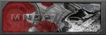
Well, I got playing in GIMP again today; found a nice glowing text tutorial... Here's what I made with it:  Its a bad size, I know. I wasn't going to be making a sig with that canvas... But by the time I remembered how big the canvas was I was already finished  |
|
MyNameDidntFit
Athenak  Top BotC Competitor! TEQUILA![M:25]
Drinks Bourbon
Posts: 596
|
Post by MyNameDidntFit on Apr 6, 2008 2:04:41 GMT -5
And uh, I couldn't help myself so I made another using the same glow text... This one is by far better.  Although I do love the background of the first one... Expect to see a combination of these in my next sig  |
|
|
|
Post by Abby on Apr 6, 2008 8:08:07 GMT -5
Wow, I like it!  How did you do the red circle blow the text? Did you cut all that out, or was it a brush or something? 8.5/10  |
|
MyNameDidntFit
Athenak  Top BotC Competitor! TEQUILA![M:25]
Drinks Bourbon
Posts: 596
|
Post by MyNameDidntFit on Apr 6, 2008 8:11:24 GMT -5
That's a brush  Normally its the same colour throughout but I did something which made some parts brighter... Can't remember what though  |
|
|
|
Post by Abby on Apr 6, 2008 8:20:21 GMT -5
Looks like you used a Gradient Map. *scratches head*
|
|
MyNameDidntFit
Athenak  Top BotC Competitor! TEQUILA![M:25]
Drinks Bourbon
Posts: 596
|
Post by MyNameDidntFit on Apr 6, 2008 8:22:18 GMT -5
If it looks like a gradient that might be the red glow from the X affecting it.
|
|
|
|
Post by Abby on Apr 6, 2008 8:34:22 GMT -5
Whatever you used, iit's pretty cool and techy looking.   The shadows give it depth |
|
MyNameDidntFit
Athenak  Top BotC Competitor! TEQUILA![M:25]
Drinks Bourbon
Posts: 596
|
Post by MyNameDidntFit on Apr 6, 2008 8:40:14 GMT -5
Glad you like it  I'll definitely be using some of the stuff I learned making that in future works. I'm addicted to GIMP now... And its all because of you damned internet people!  |
|