MyNameDidntFit
Athenak  Top BotC Competitor! TEQUILA![M:25]
Drinks Bourbon
Posts: 596
|
Post by MyNameDidntFit on Apr 27, 2008 3:29:45 GMT -5
Great new sig kitty  As I scrolled down I noticed something in your previous sig... The shiny ball/moon/thing near the top... How'd you do that? I mean this sig btw: |
|
|
|
Post by Junk Angel on Apr 27, 2008 7:57:54 GMT -5
you mean the one in the background? - The low opacity one?
Well it was in the original image, but otherwise, just make a circular selection, make it white, add some burning and dodging and put it to a low opacity screen mode.
|
|
MyNameDidntFit
Athenak  Top BotC Competitor! TEQUILA![M:25]
Drinks Bourbon
Posts: 596
|
Post by MyNameDidntFit on Apr 27, 2008 8:17:10 GMT -5
I mean the silver looking one that reflects the image... Do you know how I would go about making a similar object?
I have a rough idea of how I would try but... Yeah, its very rough.
|
|
|
|
Post by Rain on Apr 27, 2008 15:37:05 GMT -5
haha I really need to chck some tuts  I need more flair for GFX  |
|
|
|
Post by Junk Angel on Apr 27, 2008 16:18:39 GMT -5
You mean one of the two planets?
|
|
MyNameDidntFit
Athenak  Top BotC Competitor! TEQUILA![M:25]
Drinks Bourbon
Posts: 596
|
Post by MyNameDidntFit on Apr 27, 2008 23:58:20 GMT -5
I know how to clear this up... *Saves kitty's sig.* *Opens paint.* ? ? ? Profit. One moment!  Here:  |
|
|
|
Post by Junk Angel on Apr 28, 2008 8:57:42 GMT -5
Ah, well I got a nice big picture of the map, then made a circular selection
copied it to a new layer and applied a a nice spherise filter, resized the thing and put into the sig.
Cuntinued with some burning and dodging, put it again to screen.
The the PSD is you want.
|
|
MyNameDidntFit
Athenak  Top BotC Competitor! TEQUILA![M:25]
Drinks Bourbon
Posts: 596
|
Post by MyNameDidntFit on Apr 28, 2008 8:59:30 GMT -5
Ah, I thought that might have been how you did it  I'll give it a shot in my next sig. |
|
|
|
Post by Junk Angel on May 2, 2008 17:49:57 GMT -5
Heh, thanks. Something I made on GF in requests 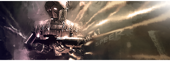 Played a bit with the light on the nice droid. and more 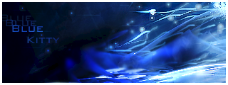 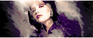 |
|
MyNameDidntFit
Athenak  Top BotC Competitor! TEQUILA![M:25]
Drinks Bourbon
Posts: 596
|
Post by MyNameDidntFit on May 3, 2008 3:52:50 GMT -5
The white border on the blue one stands out too much I think. When I look at that sig it just steals my focus and I always end up looking at the white border...
Try making it a bit smaller perhaps?
|
|
|
|
Post by Junk Angel on May 4, 2008 7:53:17 GMT -5
Yeah, you might be right with the strong border :~ Will see how it looks with a smaller one. Either way - 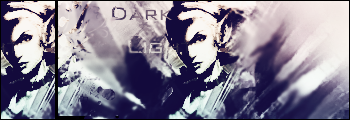 |
|
MyNameDidntFit
Athenak  Top BotC Competitor! TEQUILA![M:25]
Drinks Bourbon
Posts: 596
|
Post by MyNameDidntFit on May 4, 2008 9:11:34 GMT -5
That border is a lot better  Same thing I've said before: its great but I don't really agree with the repeat of the render between the two main ones. |
|
|
|
Post by Junk Angel on May 5, 2008 18:34:43 GMT -5
by the way - update, a few little edits 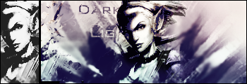 |
|
MyNameDidntFit
Athenak  Top BotC Competitor! TEQUILA![M:25]
Drinks Bourbon
Posts: 596
|
Post by MyNameDidntFit on May 6, 2008 3:05:05 GMT -5
Love the new touch  I think the B&W even makes that half render I disagreed with before look as though it fits in more... |
|
|
|
Post by Rain on May 7, 2008 15:09:02 GMT -5
That sig is amazing Kitty  |
|