|
|
Post by Junk Angel on Feb 6, 2008 16:00:36 GMT -5
oh you mean to have a link in the sig? Or how?
|
|
|
|
Post by Rain on Feb 6, 2008 16:37:00 GMT -5
Im very confused :S
|
|
|
|
Post by Junk Angel on Feb 6, 2008 16:40:42 GMT -5
yeah, me as well.
|
|
|
|
Post by Abby on Feb 7, 2008 17:01:02 GMT -5
A good topic for the Support Board. *hint hint* To make an image a link:
[url=LINK][img]IMAGE[/img][/url]To put an image: [img]IMAGE URL[/img]All codes work in the sig area. Try and elaborate a bit more, though, so I know how to help.  |
|
|
|
Post by Rain on Feb 7, 2008 17:39:04 GMT -5
Admin Auron to the rescue!  Well I hope that answered your question MC  |
|
|
|
Post by Junk Angel on Feb 13, 2008 6:15:51 GMT -5
|
|
|
|
Post by Rain on Feb 13, 2008 19:04:36 GMT -5
Is the first one of an Iron Maiden album? Excellent as usual by the way  |
|
|
|
Post by Junk Angel on Feb 14, 2008 3:52:07 GMT -5
It might be. It was a render on which the sig had to be based for a SOTW
|
|
|
|
Post by Abby on Feb 16, 2008 9:55:57 GMT -5
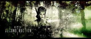
Looks great.  The last two, though, look a bit too 'painty' on the lady. Try leaving her features intact but keeping the c4d's and metal texture recognizable but still painty.  |
|
|
|
Post by Junk Angel on Feb 16, 2008 12:49:17 GMT -5
Yay, I'm aware of this problem. The thing is, I noticed to late...once I had about 8 more layers.  in the meantime, my fifth ghost sig  need some deleting on the left side though |
|
|
|
Post by Abby on Feb 23, 2008 13:15:30 GMT -5
Ooo, looks nice.  But like I said, try un-blurring the lady a little bit so we can identify her. And the text it a bit too dark for me to read against the black bg. But otherwise, it's awesome.  |
|
|
|
Post by Rain on Feb 23, 2008 13:22:40 GMT -5
Very snazzy  Just as Auron said a littl difficult to make out. |
|
|
|
Post by Junk Angel on Mar 2, 2008 9:41:17 GMT -5
EEk, I just saw some of my sigs on a 21'+ monitor, I didn't see the heavy pixelation before!
|
|
|
|
Post by Junk Angel on Mar 3, 2008 17:04:28 GMT -5
Well just remembered seeing some artwork a while ago on a card, so I went off to try and make a sig out of it My cutout And the sig itself  oh and haven't posted here yet a cortana sig. Was so tired f seeing master chief everyone, so made a little jab at all of them  |
|
|
|
Post by Rain on Mar 4, 2008 13:40:57 GMT -5
Those are awesome! I really love the text in the first one and the way the render blends in well and in the second one I love th design and effects.  10 out of 10  |
|